India,
background
buddi was building a new kind of ai product. a wearable that captures conversations and turns them into useful information for teams.
the product was interesting. the challenge was making the experience around it just as simple.
challenge
how do you take a product that combines hardware, ai, payments, subscriptions, and a dashboard and make it feel like one simple experience?
the goal wasn't just to design the screens. it was to make the journey from discovering buddi to actually using it feel natural.
my role
i worked across the product experience end to end. designed the primary website, payment flow, subscription flow, and the customer dashboard.
worked closely with the team to shape how buddi should look, feel, and work across the entire customer journey.
buddi had a lot happening behind the scenes.
a wearable captures the conversation. ai processes it. the product turns it into something the customer can actually use.
my job was to make that complexity feel simple.
1. the product was new
people needed to understand what buddi actually did without having to learn how the technology worked.
2. the journey had multiple steps
website, payment, subscription, and dashboard all had to feel connected rather than like separate products.
3. the dashboard needed to show the value
the recording itself wasn't the point. what happened after the conversation was.

how i approached it
i started by looking at the experience as one continuous journey rather than a collection of screens.
someone discovers buddi.
they understand it.
they decide to buy.
they subscribe.
then they land inside the product.
each step had to answer one simple question: what does the user need to know or do next?
designing the product
the website focused on making the idea easy to understand.
the payment and subscription flows were kept simple and connected to the same visual language.
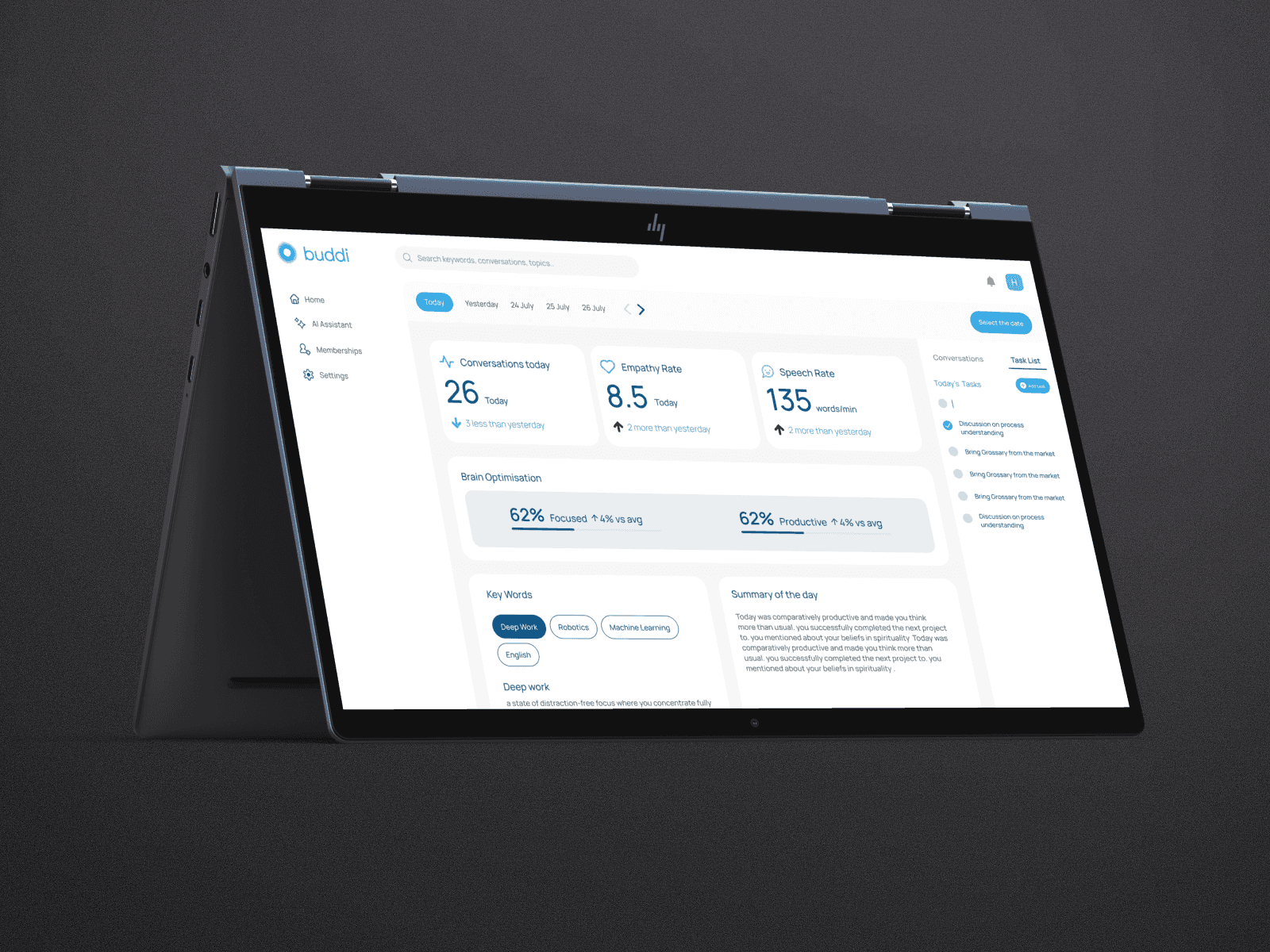
then came the dashboard, where the actual value of buddi had to come through.
instead of treating conversations as recordings, the experience focused on what users could get from them: summaries, important information, actions, and insights.

the impact of the work
built the initial customer-facing experience for buddi from the ground up.
primary website
customer dashboard
payment flow
subscription flow
core product experience
the bigger outcome was creating one connected experience across discovery, purchase, and everyday use.


key learnings
buddi was a good reminder that sometimes the interesting design problem isn't one screen.
new products need a simple story. people shouldn't have to understand the technology to understand the value.
the dashboard isn't about showing more information. it's about helping people find what matters.
payment and subscription are part of the product experience too.
consistency isn't just visual. every step should feel like it belongs to the same product.